This past year I’ve seen a lot of the same awesome as years past. Great designs, great collaborations, talented people doing their thing. As in past years, we (Collect) like to go through some of our favorite Spokane moments of the year. I personally find it so important to acknowledge where we’ve been before entering a new year. We can celebrate, remember and get inspired for the next chapter. Hopefully, this list does just that for you!

10. Baby Knives gives local artists room to play
Aaron Abolofia is a print guru and local designer. He launched a monthly art zine only a couple months back called Baby Knives and it is becoming more and more anticipated with each issue. It has allowed designers to do something for themselves and themselves alone. Without the subversive desire for likes on instagram or client approval, the art inside Baby Knives is just art for the sake of it. Follow Baby Knives in insta for updates.
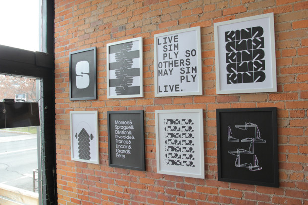
9. Eric Smith’s Practise exhibit opens door to minimalism
Eric Smith was in and out of Spokane this year with a brief stint working at Apple’s headquarters. Earlier this year he put together a solo exhibit called Practise at The Bartlett. The show was minimal, flat, black and white, thoughtful yet friendly as most of Eric’s work tends to be. I always love any movement locally towards simplicity. It challenges the PNW’s often heavy handed desire to make everything texturey and filled to the brim with bells and whistles. A minimal design aesthetic is the most challenging. Thanks to Eric for leading the way. View Eric’s website.
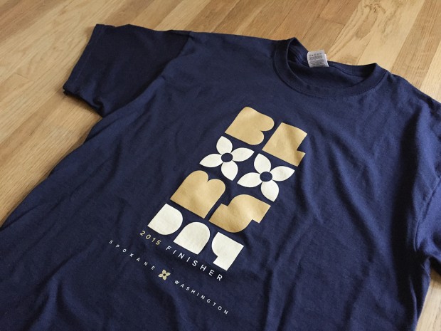
8. Jacob Greif’s Bloomsday 2015 design marks new territory for Spokane institution
When I saw this year’s Bloomsday shirt I was intrigued! Such a different choice than years past. When I found out Jacob Greif was the designer, well, you can imagine my glee. I love how this design is modern and simple but also kind of nods to some of the retro designs of the first few Bloomsday tees. Visit Jacob’s site.
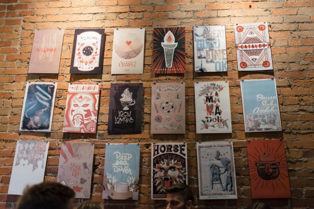
7. Bartfest Poster Show 2015 shows depth of skill among local designers
In year #2 of the Bartfest Poster Show we saw quite a departure from the year before. The musical lineup for the festival itself was a bit less electronic/pop focused and a little more folk driven this year and the designers were up to the challenge of matching musical inspiration with aesthetic. The thing I loved the most about this year is how different each poster was. It shows a group of talented designers each with their own style and own taste. No need to just copy one trend or style.
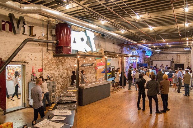
6. Terrain 2015 was best art explosion yet
Full disclosure, I got to be one of the jurors for Terrain this year. It was a fantastic experience, and ultimately super challenging. You have to sift through 1300 pieces of art and select under 300 to be shown. There was a lot of really amazing art and I was so amazed by how the show turned out. Terrain is such a foundational piece of the young art scene in Spokane. It has given young artists in this town a place to feel at home and to feel understood. I can’t imagine Spokane without it.
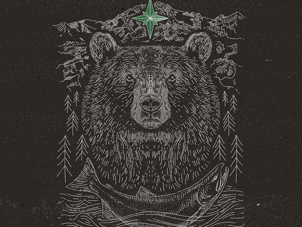
5. Jon Deviny blows us away and inspires local design community
There’s not much to say about this except for Jon Deviny is making us all look bad. Not even being sarcastic. I’m seriously thankful when new talent emerges. I’ve personally felt inspired and have heard so many other designers talking about it. Good work makes you want to step up your game. See more of Jon’s work.

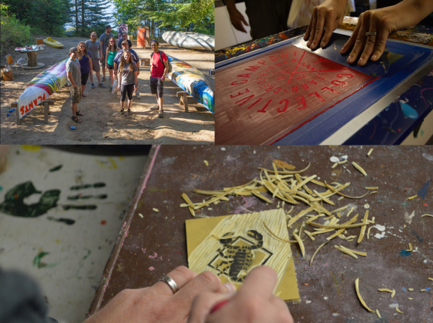
4. Collective Campout : Annual Art/Creativity Camp for Adults
Not only was the brand (created by John Mujica) for Collective Campout totally rad, but the actual camp was legit. I’m a cynic, so my expectations were low. But try combining a beautiful PNW rustic setting, a bunch of heavy hitters from the design community, a bunch of inspiring talks, hands on activities, a little booze and some dance parties? IT WAS AWESOME. The local AAF chapter spearheaded the event and were joined by a ton of awesome sponsors like The Great PNW, The Inlander and more. It was the perfect combo of relaxing and inspiring and I actually can’t wait for next year. Visit the site.
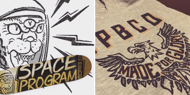
3. Space Program Board Co. Launch
The Great PNW launched via kickstarter out of Spokane a couple years ago and is now selling in big retailers like REI and favorite local shops like Atticus. Space Program Board Co. launched in similar fashion this year by a local skater/designer talent named Sebastian Lopez. The gear is fresh and even though it’s focused a bit on skate culture, it’s approachable by anyone who likes cool designs and lots of personality. We hope as much success for this locally designed and created new brand. Go team! Check the goods here.
2. Treatment makes huge waves in 1st year
For years I’ve been saying Spokane needs a small hip design agency. Well, this year was our year. Treatment might not call themselves a “design agency” but they make awesome designs thanks to the one-woman-show that is Vanessa Swenson. Add a talented writer, developers, marketing strategists, video producers and an all around badass crew and you have Treatment. In just the first year they’ve done some amazing high profile projects like the Chinese Lantern Festival, The Mayor’s Urban Design Awards and more. Hip hip hooray for more good design filling in the nooks and crannies of this city! Visit Treatment.
1. Spokane Arts Launches the Signal Box Project
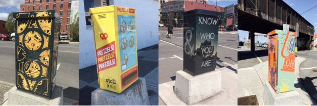
Last but not least, I felt like this project was a great showcase of what is possible when the city chooses to engage local designers to make downtown more fun, intriguing and feel more like home to young people. The Signal Box Project is not a reinvention or new concept. It’s been pioneered in many other towns long before Spokane picked up the idea. But we DID IT. That’s big and I’m excited. The city was initially reticent to adopt the project but thanks to STCU and Global Credit Union, Spokane Arts was able to facilitate it on 2nd ave downtown with the funds necessary. Hopefully the rest of downtown is next, or at least a more walkable section. More info about Spokane Arts.
____

