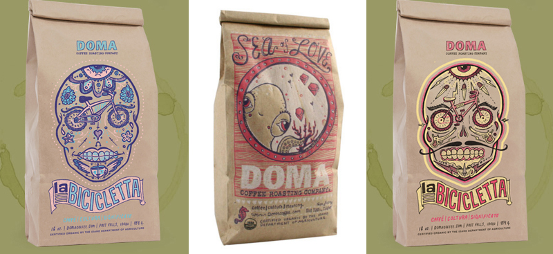
Went to the Addy’s last night, and was really excited to see a lot of local small businesses get recognized for their products and branding. More and more business owners in town are realizing the importance of image and hiring really talented folks to help them out. This is not only awesome for them, but it continues to raise the bar and inspire other folks that might be behind the curve with marketing. Doma cleans up every year at the Addy’s thanks to Chris Dreyer and Dreyer Press and this year was no different. The amazing Tiffany Patterson’s “Sea of Love” packaging took home Best in Show for print! AMAZING. And Doma received several other outstanding awards.

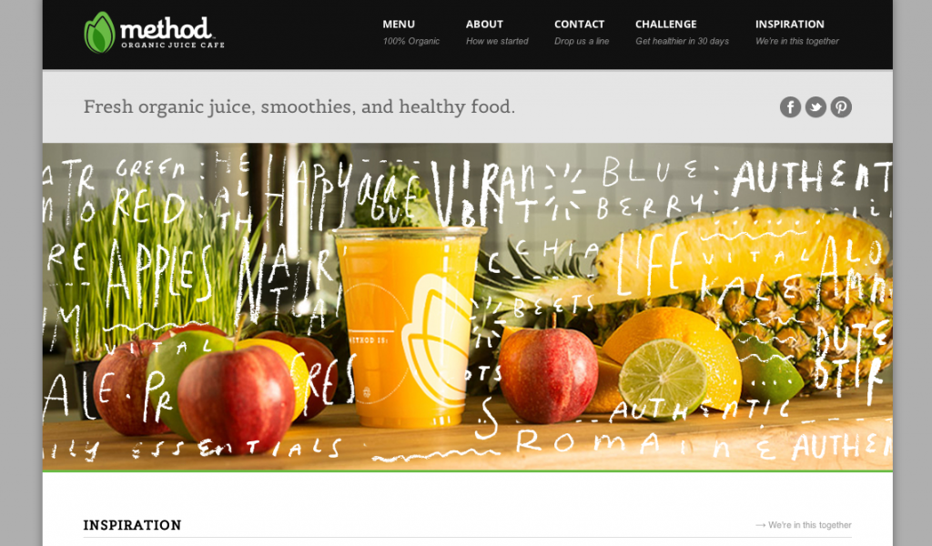
Also excited to see the awesome, Eric Smith’s work for Method Juice Cafe take home some awards. Eric works at Seven2, who pretty much dominated the whole event winning tons of awards and living up to their loud and rowdy reputation.

There were tons of amazing student designs…several of them were my favorites of the night! I’m going to work this week on tracking down images of some of my favorite winners. Lots of great design and hard work represented. Happy to be a part of this great community!
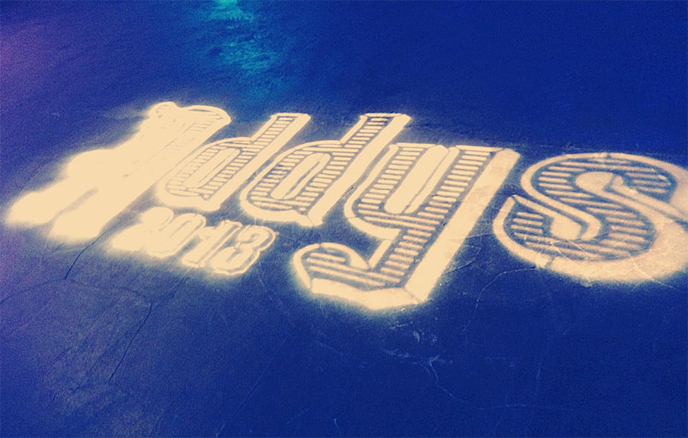
I posted before about how much I liked the invitations for the Addy’s and the Moby Dick theme. I don’t want this to be a critique blog, but I was disappointed to see that the theme did not carry over into the event well. I loved the vintage type, which was used in slides and on the actual awards, but the event design style was more sparkly and almost cartoon inspired with a drag performance of a lip-synced song from the little mermaid as the beginning of the show. Although it was unique and the stage set up was nice, it definitely didn’t feel cohesive with the collateral material or my initial impression of the event branding.

